
1. Context &
Challenge
BBX is a company founded in 2011, initially focused on industrial outsourcing, which expanded its operations to diverse services (curtain installation, electrical work, painting). Its key differentiator is service excellence and long-term customer relationships, with most new business coming from referrals (word-of-mouth).
The previous visual identity, however, presented serious problems: it was amateur and generic, lacked color balance and vectorized versions, and failed to convey the brand's strength or create a real customer connection.
The objective of the redesign was to create a more trustworthy, distinctive, and versatile brand, capable of adapting to multiple contexts and conveying solidity in a competitive industrial sector.
Previous communication


Services
Products
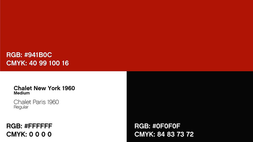
Identity (One of multiple versions)
2. Process
The redesign was guided by a process that balanced strategic diagnosis, creative exploration, and alignment with company owners.
The redesign was guided by a process that balanced strategic diagnosis, creative exploration, and alignment with company owners.
The redesign was guided by a process that balanced strategic diagnosis, creative exploration, and alignment with company owners.
Diagnosis
Direct conversations with owners to understand strategic objectives and brand weaknesses.
Research
Moodboard development and competitor research (logo, typography, application analysis) to define visual direction.
Creative Development
Manual sketching and digital refinement (typography, visual weight, color balance).
Versatility Concept
The core guiding concept was versatility: a brand that could adapt to different contexts (uniforms, social media, print) while simultaneously conveying trust.

Validation
Definition of monochromatic and alternative versions to ensure consistency across different supports.
3. Solution
The new visual identity delivered a modern, robust, and flexible brand.


It incorporated a check-mark symbol, representing validation and confidence, directly reflecting the company's successful referral model.
It achieved chromatic and typographic balance, reinforcing professionalism.

It gained alternative versions to broaden its usability and consistency. The design ensured brand presence across diverse applications, from products to print materials.

Users can create workspaces and cards, customizing everything to their liking, which helps foster community and alignment.


